Videology
Senior Director, User Experience and Design
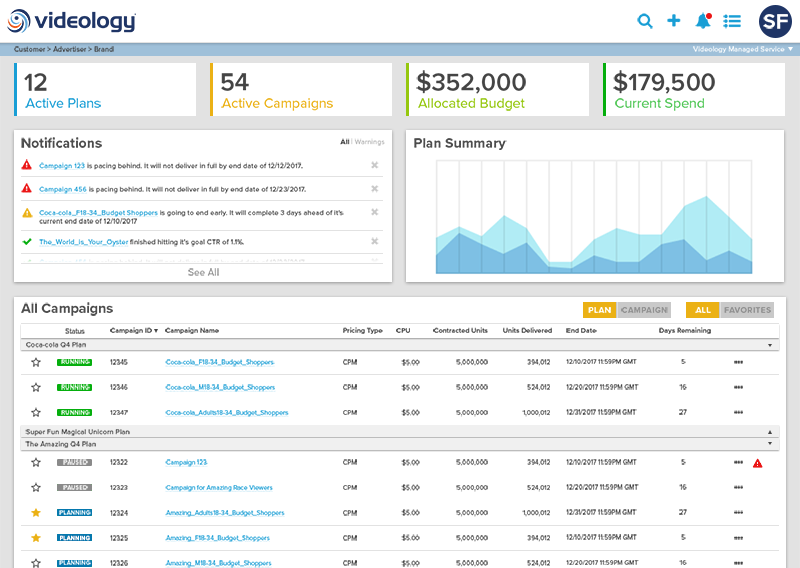
Videology is one of the largest global advertising companies, focused on merging the divide between digital and TV advertising with a single converged platform solution.
As Senior Director, User Experience and Design, I manage a team of 8 designers and developers, while facilitating an attitude of cross-team collaboration and results-oriented decision making.
Here a few of the key improvements I've implemented to date:
UX Team Reorganization
The UX team was off balance when I joined with little sense of ownership and delegated to being order-takers.
By working with each team member and understanding their personal goals, I balanced that with the goals of the company and realigned each member to own a piece of the process, while keeping everyone involved and engaged as we evolved.
Today we are one of the most respected parts of the organization and add value to every feature that is introduced to the platform using the methods listed below.
Sketching, Wireframing, Iteration, Oh My!
I believe in learning fast and what's faster than knocking out a few rough sketches?
I require the team to start sketching before jumping into the computer and that's where we talk through ideas and oftentimes start discussions with users.
The team was using InDesign for all high fidelity (don't ask me why...) and doing no wireframing. We now run both our wireframing and high-fidelity concepts through a single file in Adobe XD. This is also the file used to give the front-end developers guidance on styling. Three birds, one stone.
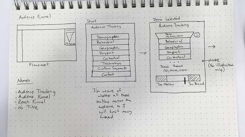
Understanding When It's Less Expensive
There was little to no user testing. This was the first thing that I tackled. The below images is how I explained to the company that we were building the wrong thing. On top of that, the truth of the matter is, for every $1 you spend in the design phase, you save $6 in development, and $100 post-launch.
Weekly User Testing Cadence
We were moving fast and had a lot to learn.
The easiest way to make something a habit is to do it consistently, so without fail, every week the team would hold user testing sessions. It didn't matter if it was sketches, clickable prototypes, high-fidelity finals, or live code. We just had to do it with something.
I'm proud to say the team has gotten really good at all parts of the process, from the interview to presenting our findings back to product and involving all teams along the way.
Testing With Users in Sandbox
As the design phase became standard practice, I worked with the engineering team to collaborate with the UX team and run 1-2 user sessions during the sandbox development of features.
So now we were learning multiple times prior to feature release!
In addition, this step reduced production bugs by 68% in the first month, and increased to 73% in month two.
Cross-Team Collaboration
A key to the success we've seen is that it's routed in the fact that I believe there is a trifecta to building products. Product + Engineering + UX = Success.
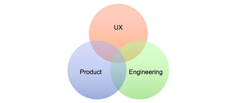
By doing less "hand-offs" and more collaboration you reduce the time inbetween responsibilities (or wait time) and move along together at a more consistent pace. That's easier for everyone.
Iteration/History Pages
Pages that track the project from the time UX is involved until development is complete and the feature is released. We used confluence to track every meeting (with pictures of whiteboards), sketches, clickable prototypes, high-fidelities, and all the user interviews and testing along the way.
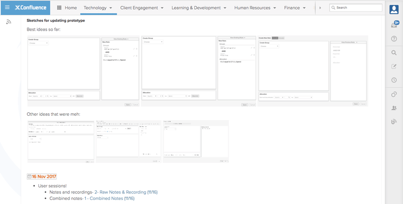
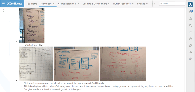
This concept has helped beyond the original intention of sharing why UX made each decision and the itrations along the way, but also as a jumping off point for someone new to the project to get caught up easily with pictures instead of a requirements doc (which never tells the whole story).
Design Language
Our design language is why we design the way we do. It's our principles, the first of which is that we will manage our information hierarchy and our design hierarchy with equal importance. For our platform, that is key.
In addition to the why, we have started to put together the how, with a design system that is integrated into Adobe XD and meshes our current platform with a new vibrant direction.
User First Functionality
Users were cramped into small areas of working. In response, we've begun to open up the experience so the user has the full screen to work in edit mode. This has been met with a huge positive response.
Plus these new designs look much better and are far more intuitve because they are user tested multiple times over before hitting production!